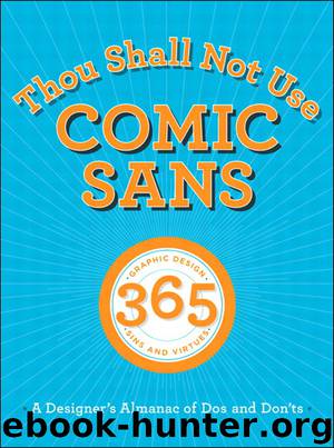
Thou Shall Not Use Comic Sans: 365 Graphic Design Sins and Virtues: A Designer’s Almanac of Dos and Don’ts (Chris Chae's Library) by Sean Adams & Peter Dawson & John Foster & Tony Seddon

Author:Sean Adams & Peter Dawson & John Foster & Tony Seddon
Language: eng
Format: epub
Publisher: Peachpit Press
Published: 2012-06-15T16:00:00+00:00
186: Thou shall not use process color for small body text
Commentary Process colors—cyan, magenta, yellow, and black—combine to create four-color images. Black is a good choice for small body text, as it is legible and prints clearly. Cyan, yellow, and magenta do not work for small body text. First, returning to how we read, we look at individual letters and combine them to make words, which make sentences, and paragraphs. Differentiating the characters is the basis of the process. Cyan, yellow, and magenta are too intense to work well together. Alone, they are each too intense or light to be seen clearly. Secondly, a paragraph printed in magenta is bright and tiring to read. It’s as if you ask the viewer to look at the sun. It looks nice, but you will go blind when you stare at it too long. To be safe, make sure text is legible. Body text should be set in darker tones or black. SA
Download
This site does not store any files on its server. We only index and link to content provided by other sites. Please contact the content providers to delete copyright contents if any and email us, we'll remove relevant links or contents immediately.
A Swirl of Ocean by Melissa Sarno(50991)
The Book of Dreams (Saxon Series) by Severin Tim(33358)
Cecilia; Or, Memoirs of an Heiress — Volume 1 by Fanny Burney(32538)
Cecilia; Or, Memoirs of an Heiress — Volume 2 by Fanny Burney(31935)
Cecilia; Or, Memoirs of an Heiress — Volume 3 by Fanny Burney(31925)
Call Me by Your Name by André Aciman(20484)
Eleanor and Park by Rainbow Rowell(15444)
Always and Forever, Lara Jean by Jenny Han(14884)
For the Love of Europe by Rick Steves(13872)
Norse Mythology by Gaiman Neil(13332)
Crooked Kingdom: Book 2 (Six of Crows) by Bardugo Leigh(12301)
Shadow Children #03 - Among the Betrayed by Margaret Peterson Haddix(11912)
Among the Betrayed by Margaret Peterson Haddix(11602)
Twisted Palace by Erin Watt(11137)
Six of Crows by Leigh Bardugo(10173)
They Both Die at the End by Adam Silvera(9802)
P.S. I Still Love You by Jenny Han(9575)
Fangirl by Rainbow Rowell(9226)
Thirteen Reasons Why by Jay Asher(8883)
